

Excel has always been my go-to tool for data management and analysis, but with the integration of AI, it has become even more powerful. One of the most exciting features leveraging AI is Analyze Data, previously known as Ideas. This tool makes data analysis more intuitive and insightful by using natural language queries and providing high-level visual summaries, trends, and patterns. Let me share with you how I unlock the full potential of AI in Excel using Analyze Data, complete with detailed examples to illustrate its capabilities.
The Evolution from Ideas to Analyze Data
Why the Change?
Microsoft rebranded Ideas to Analyze Data to better reflect its enhanced capabilities. While the name has changed, the functionality remains the same, making data analysis more intuitive, faster, and simpler while adhering to the same privacy and licensing regulations. If you’re on the Semi-Annual Enterprise Channel, you might still see the old name until your version of Excel is updated.
Core Features of Analyze Data
Analyze Data in Excel allows you to interact with your data through natural language queries. This feature eliminates the need for complex formulas, providing high-level visual summaries, identifying trends, and spotting patterns in your data effortlessly.
How I Get Started with Analyze Data
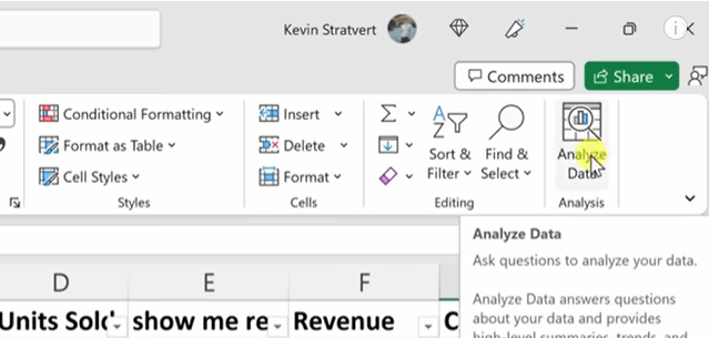
Accessing the Feature
To start using Analyze Data, I follow these simple steps:
- Select a cell within your data range.
- Click the Analyze Data button on the Home tab.
- Excel will analyze your data and display interesting visuals in a task pane.
For instance, if I have a sales dataset, I select a cell within this dataset and click Analyze Data. Excel provides various visual insights, such as total sales over time or top-selling products.
Asking Questions
For specific queries, I enter a question in the query box at the top of the Analyze Data pane and press Enter. Analyze Data generates responses with visuals such as tables, charts, or PivotTables, which I can insert into my workbook.
Example:
Suppose I want to know, “What was the total revenue last quarter?” I type this question into the query box, and Analyze Data provides a visual representation of my revenue for the last quarter, possibly in a bar chart or a summary table.
Suggested Questions
If I’m exploring my data or unsure what to ask, Analyze Data offers personalized suggested questions based on an initial analysis of my data. I can access these by selecting the query box and reviewing the suggestions provided.
Example:
In a dataset containing sales information, Analyze Data might suggest questions like “What are the top 5 products by sales?” or “What is the monthly sales trend?” Clicking on any of these suggestions generates the corresponding visuals and insights.
Maximizing Analyze Data’s Potential
Natural Language Queries and Availability
Natural Language Queries functionality in Analyze Data allows me to ask questions in plain language and get responses in visual forms. This feature is gradually being rolled out to Microsoft 365 subscribers and is available in multiple languages, including English, French, Spanish, German, Simplified Chinese, and Japanese. I ensure I have the latest Office version to access these features.
Specifying Fields for Targeted Analysis
If I have specific fields I want to focus on, I streamline the analysis process by selecting only those fields. This saves time and results in more targeted suggestions.
Example:
Imagine I want to analyze only the yearly sales data in my dataset. By selecting the fields related to sales and year, I can ask Analyze Data to show the sum of sales by year or the average sales per year. This focused approach helps in obtaining precise insights.
Handling Large Datasets and Compatibility Issues
Analyze Data supports datasets up to 1.5 million cells. For larger datasets, I filter my data and copy a subset to another location to run Analyze Data on it. Also, I ensure my dates are formatted correctly and that my file is saved in a compatible format (.xlsx, .xlsm, or .xlsb). Avoiding merged cells also helps prevent analysis issues.
Practical Examples of Analyze Data
Example 1: Sales Analysis
I have a dataset containing monthly sales data for various products over the past year. By selecting a cell in the dataset and clicking Analyze Data, Excel might show visuals such as:
- Total sales per month: A line chart showing how sales have trended over the months.
- Top-selling products: A bar chart highlighting which products have sold the most.
I can further refine my analysis by asking, “Which month had the highest sales?” Analyze Data quickly provides the answer with a corresponding visual, such as a highlighted bar in a bar chart.
Example 2: Customer Insights
Suppose I have customer feedback data with ratings and comments. By using Analyze Data, I can ask, “What is the average customer rating per product?” Excel might generate a table showing average ratings for each product, helping me identify which products are performing well in terms of customer satisfaction.
Example 3: Financial Analysis
Consider a financial dataset with expenses categorized by departments. Using Analyze Data, I can explore questions like, “What are the total expenses by department?” The feature presents the data in a visual format, such as a pie chart, showing the proportion of expenses for each department.
Tips for Effective Use of Analyze Data
Formatting Your Data
For the best results with Analyze Data, I ensure my data is clean and formatted as an Excel table. Here are some tips:
- Format as a Table: Select your data and press Ctrl+T.
- Use Clear Headers: Ensure your headers are a single row of unique, non-blank labels.
- Avoid Merged Cells: Use Center Across Selection for formatting instead of merging cells.
Compatibility and Data Preparation
- Dataset Size: Keep your dataset within 1.5 million cells.
- Date Formatting: Use DATE or DATEVALUE functions to ensure dates are formatted correctly.
- File Format: Save your file in .xlsx, .xlsm, or .xlsb formats to avoid compatibility issues.
- Clean Data: Remove merged cells and ensure headers are clear and consistent.
Continuous Improvement and Future Insights
Current Capabilities
Analyze Data continually evolves, with Microsoft expanding the types of analyses it supports. Currently, it offers several types of insights:
- Rank: Identifies and highlights items that are significantly larger than others.
- Trend: Highlights steady patterns over time.
- Outlier: Identifies anomalies in time series data.
- Majority: Finds cases where a single factor accounts for the majority of a total value.
Example:
Using a payroll dataset, Analyze Data might identify that “Payroll expenses in December were significantly higher than in other months” and display this insight through a line chart.
Future Enhancements
Microsoft is dedicated to enhancing Analyze Data, ensuring that it supports a broader range of insights and becomes even more powerful and versatile for users. As these updates roll out, users can expect even more refined and insightful analyses from their data.
Conclusion
Unlocking the power of AI in Excel through the Analyze Data feature has been a transformative experience for me. This tool has taken my data analysis capabilities to new heights, allowing me to interact with my data in more intuitive and insightful ways. Whether you’re using natural language queries to ask specific questions or exploring suggested questions to discover new insights, Analyze Data empowers you to make data-driven decisions with ease.
By following the tips and examples I’ve shared, you can maximize the potential of Analyze Data and make your data work for you. Embrace this powerful tool to enhance your Excel experience and uncover the full potential of your data. With continuous improvements and future enhancements, Analyze Data will only become more capable, helping you stay ahead in your data analysis tasks.